Summer is never my best season and although I’ve been doing magnificently well in keeping (relatively) cheerful this year, it has been hard work. And last weekend I completely ran out of energy for keeping the black dog at bay. It had been snapping at my heels for a while and by Saturday I felt completely paralysed by inertia and misery.
Which isn’t a great state to be in when you have a sketchbook to fill… I’d planned to do some actual sketching, but couldn’t face the effort involved in even deciding what to attempt to draw. I stuck some layers on my papier-mâché bowl as that was a purely mechanical task and did some more lying around feeling utterly crap.
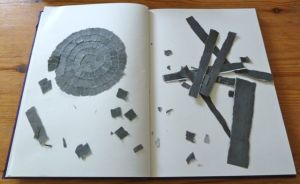
Eventually it occurred to me to try and depict how I was feeling. Thinking about it now a spiral of darkness seems a pretty clichéd symbol of depression, but at the time the idea animated me enough to send me to my pile of newspapers in search of suitable material. As it happened the first thing I picked up had a full page advertisement on the back which was mostly shades of dark grey. Perfect.
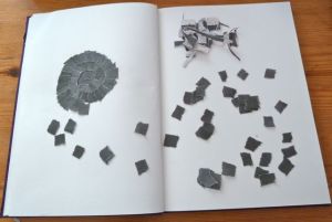
So I sat down at my blank page, tore some small squares from the sheet of greyness and started sticking them down. The relief of being absorbed in the task was immense. At first I was simply tearing and sticking – the only decisions I made were to work in an anti-clockwise direction and not to leave any gaps between the spirals. I didn’t pay any attention to the shading or to the shape of what I was making.
I only had enough energy for short sessions of tearing and sticking. So I did a bit here and there between long rests and doing all the shit that has to be done whether you feel like it or not. In session two or three I noticed that I was beginning to pay attention to the shading and shape. Instead of simply taking a scrap of paper and gluing it down, I was making choices about the balance and placing of darker or lighter shades. I had to get a compass and draw a guide circle to satisfy my need to create a neat shape.
I observed myself edging from just-doing to slight control-freakery with wry amusement. So typical! I also observed the calm that comes with being absorbed in a pleasurable task and the pain of simply not having enough energy to alleviate depression with activity for more than a short space of time. Yes, something is better than nothing, but that doesn’t make the grief of not being able to do more any less painful.
As the spiral got bigger the problem of how to end it began to loom. I started with a vague idea of filling the whole page, but my supply of material was limited and I was making something far neater than I expected to, so a slight tension began to build up about when to stop. I carried on on the basis that if you aren’t sure, add more, until suddenly I knew that it was finished. I’d pretty much run out of the lighter greys, so if I made another circuit I’d make a border of dark grey that would be visually unappealing.
 And then, rather than accepting that moment of awareness that it was done, I added one more small piece in a misguided attempt to make it look more “finished”. It didn’t work and I couldn’t remove that piece without messing up what should have been the last one. Sigh. Oh well, it’s a sketchbook. It’s about learning, not perfection.
The original “end” occurred at about the place where the two would be on a clock face, leaving the spiral open. After some deliberation I decided to close the gap up to the top of the circle rather than leave it with the fuck-up piece glaring at me every time I looked at it. If I’d been planning such a completion I’d have graduated the edge better, but I like it better than the fucked-up version. Though that bulge on the upper right will always be a reminder to STOP when I’m “told” to!
As a depiction of my depressive episode the piece is pretty much a failure – the reality is far more chaotic and much darker. Still, it was good therapy and an interesting sketchbook exercise. I learnt a lot from doing it and will experiment further with collaged spirals and circles. It might be a good way to decorate the papier-mâché bowl I’m making.
Have you ever tried to depict a mood as a creative exercise or as therapy? What technique(s) did you use? What did you learn from it?


Have you read any of Danny Gregory’s books? This reminds me a bit of the one called ‘A Kiss Before You Go’ which is an illustrated journal about the time when his wife passed away. What’s noticeable in his drawings is how his use of colour seems to really get across the way he was feeling at the time. There’s an interesting video about it here: http://vimeo.com/65247317
Hi concretemoomin, yes, I’ve read The Creative License, but I have so far avoided DG’s memoirs about his wife as I find grief a hard subject to handle. I did watch the video though and found his thoughts about the process of creating an illustrated memoir interesting, especially what he said about using colour. I do tend to favour monochrome palettes myself – something I’ve noticed before from my Pinterest choices! Much food for thought. Thank you.